

I have spent more than 900 nights in short-term rentals and hotels, and I book almost all of them the same way: on a phone, at night, slightly too tired to be patient. That is your guest. Not the imaginary person with a big screen and a free afternoon. A person with a thumb, a weak signal, and four other tabs open. Every page on your website is competing with the tab to its left, which is usually the same house on Airbnb, where they already know how everything works.
So this guide is about design in the only sense that matters for a rental: what each page has to do, in what order, so that tired person books before they give up. I'll go page by page, the way I do when we start a site at Cavmir, and I'll give you the rules we build by. Some of them are opinions. I'll tell you which.
If you're still deciding whether to build a site at all, start with the step-by-step build guide. This one assumes you're building, and you want it to look like it was made by someone who has stayed in a lot of houses.
The First Screen
The first screen is the one thing a visitor sees before deciding whether to scroll. It has three jobs: show the place, say what it is, and offer a way to check dates. Anything else on that screen is noise, and noise on a phone is fatal.
The photograph
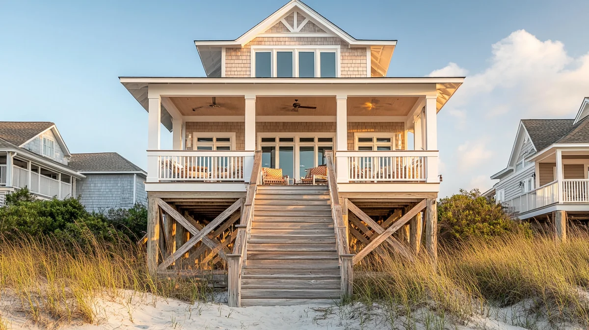
Full width, edge to edge, no rounded frame, no white margin, no gray band above it with a logo floating in it. The image is the page. Choose the one photograph you'd put on a billboard, and check it at two sizes: a wide laptop, where it shows as a landscape, and a phone, where it's cropped to a tall rectangle. Most exteriors survive that crop if the house sits in the middle third of the frame. Most interiors don't; the sofa ends up half out of the picture. Pick with the phone crop in mind, or pick two photos and let the site show the right one to each screen.
A short video loop beats a still, when it's done well. Fifteen seconds, one fixed camera, something moving in the frame (water, curtains, light), no music, and a poster image that shows before the video loads. The photography and video guide covers how to shoot it. A loop that stutters or takes four seconds to appear is worse than a still, so if you can't make it light, don't use it.
The sentence
One line, large, heavy type, white or black depending on the photo. It names the place and says one true thing about it. "Three bedrooms on the quiet end of the beach." The copywriting guide has the formula; the design rule is that the line stays short enough to sit on two rows on a phone without shrinking to nothing. If your sentence needs three rows at a legible size, it's a paragraph. Cut it.
The date search
Check-in, check-out, guests, a button. On a laptop it sits in the lower third of the image; on a phone it sits just under the image, where a thumb rests. This is the part hosts skip because the booking engine "is on the property page." It has to be here too. A returning guest opens your site to book, not to browse.
What goes under the first screen
The rest of the home page is short, and every block on it has a job. Three or four reasons to pick this house over the others in town, each one a fact with a photo: the private dock, the walk to the square, the bunk room, the hot tub under the pines. A strip of two or three reviews with first names and months. A map with drive times to the things guests come for. A short block on why to book direct, in the guest's terms: best rate, no platform fee, a person to call. Then a second date search, because the guest who read this far is ready and shouldn't have to scroll back up. If you have more than one property, the home page shows them as large cards with the photo, the name, the town, and the sleeps count, and nothing else; the details live on the property pages.
The two things that break this screen
First, the fixed navigation bar. White menu text over a bright photo disappears, and a menu you can't read is a broken site, not a polish issue. Put a soft dark gradient behind the bar over imagery, and switch it to a solid bar once the visitor scrolls past the photo. Second, the phone header. On desktop the title sits in the lower part of a tall image with room to spare; on a phone the same layout can push the title up underneath the fixed header. I have found this bug on more sites than I can count, including ones we built before we learned it. Check the phone version on a real phone, not in a desktop browser made narrow.
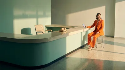
Walk into a good hotel lobby and notice how little is asked of you. One desk, one person, one question: "Checking in?" The first screen of your website is that lobby. If it takes a stranger more than a second to know what the place is and where to go next, the lobby is cluttered.
The Property Page
Every other page exists to get people to this one, and this one exists to get people to the book button. Here's the order I lay it out in, top to bottom, and why the order matters.
1. The gallery
Twelve to twenty photographs in the order a guest would walk the house: the arrival, the entry, the living space, the kitchen, each bedroom, each bathroom, the outdoor space, the view, then the neighborhood. On a laptop, show a large lead image with a strip of thumbnails; on a phone, a swipeable strip with a counter so the guest knows how many are left. Don't bury the gallery behind a "see all photos" button as the first thing on the page. Photos are the reason they came.
2. The facts band
Directly under the gallery, a single row of the things guests ask first: sleeps 6, 3 bedrooms (king, queen, two twins), 2 bathrooms, parking for 2 cars, dogs welcome, fast Wi-Fi with the measured speed, check-in from 4 p.m. This band answers a page of questions in one glance, and it's the part of the page that gets screenshotted and sent to the rest of the family. Give it real type size. A row of tiny gray icons with tinier labels is a facts band nobody reads.
3. The description
Short paragraphs, plain words, the flaws included. What it's like at seven in the morning. What's a five-minute walk away. What you provide and what you don't. The copywriting guide handles the words; the design rule is measure. Keep lines around 60 to 75 characters wide on a laptop. Copy that runs the full width of a big screen is unreadable, which is why so many sites look "empty" and "hard to read" at the same time: they let a single column float in the middle with margins the size of the column. Fill the width with photos, maps, and facts, and keep the text column narrow inside that.
4. Rates and the calendar
A live calendar with real nightly rates, and a total that includes cleaning, taxes, and any deposit as soon as dates are picked. The total is not a detail. It's the moment the guest compares you with the platform tab, and if the platform shows a total and you show "from $250," you lose the comparison on trust before you lose it on price.
5. Rules, policies, and the map
House rules in sentences. Cancellation in one paragraph a person can picture. A map with the real location (or the real block, if you'd rather not show the house number before booking) and the drive times to the things guests come for. Then the reviews, again, close to the button.
What the good hotel pages taught me
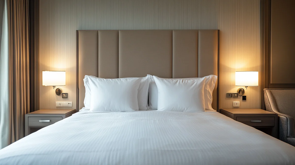
Most of my design instincts for rentals come from hotels, because hotel websites have been solving this exact page for twenty years with real money on the line. Notice what the good ones do. The photography is edited hard: a dozen images, each one earning its place. The room facts sit in a tight band at the top. The rate is shown with the dates, not hidden behind a form. The policies are one paragraph, not a legal appendix. And the book button never leaves the screen. A rental has one thing hotels don't, which is a person behind it, and that's the one thing the property page should add: a line in the host's voice, a face further down the page, and rules that sound like they were written by someone who'll notice.
6. The book button that follows you
On a phone, the book button lives in a slim bar pinned to the bottom of the screen, showing the nightly rate and the dates if they've been chosen. On a laptop, the booking box sits beside the content and stays in view as the page scrolls. The guest should never have to scroll back up to book. Every scroll back up is a chance to notice the other tab.
The Area Guide Pages
Area guides are the pages most hosts treat as filler and most guests treat as the reason to pick your house over the one two streets over. They also happen to be the pages search engines like best, because they answer the questions people type. The content marketing guide covers how to choose topics and write them. Here's how to design them so they get read.
One page per question
Not one enormous "things to do" page. One page for beaches, one for where to eat, one for rainy days, one for a trip with kids, one for the season you're trying to fill. Each with a plain title that names its content ("Beaches near the house, ranked by how far you'll walk"), because a plain title is what someone searching will actually type, and because a clever one tells them nothing.
The layout that works
A wide photo of the place at the top, edge to edge. A two-sentence intro. Then a numbered list of entries, each with a photo of the real place (yours, or one you're licensed to use with the credit shown right on the image), the name, the drive or walk time from your door in minutes, and three or four lines of what to expect. A small map at the end with the entries pinned. Keep the reading column narrow and let the photos run wide; a guide that's a wall of gray text at full screen width is the reason people bounce back to a listing.
The map that sells the trip
Every guide page ends with a map, and the map is not decoration. Pin the house, pin every entry on the page, and label the drive or walk time on each pin. A guest looking at that map is doing the thing that turns a browse into a booking: imagining the week. Breakfast here, the beach there, back for a nap, dinner at the fish shack on the pier. Keep the map simple, with your pins and nothing else, and make sure it works on a phone with a thumb, because the person planning the week is usually doing it from the sofa.
A contents rail, kept short
On a laptop, a slim sticky list of the sections on the left lets a reader jump. Keep it to seven to ten entries. A rail with twenty entries at body size becomes a tower that's harder to read than the article, and I've shipped that mistake myself. On a phone the rail collapses into a short row of chips above the text.
Photos of the actual places
The guide is only as trustworthy as its pictures. Use your own photos of the beach, the taco place, the trail head. If you use someone else's, use ones you're allowed to use and put the credit on the image where it can't be lost in a redesign. Our photo guide covers what to shoot; the credit rule exists because copyright letters over one uncredited photo are a real thing hosts receive.
The hotels that impressed me most had a concierge who said "skip that one, go here instead." Write your guide the same way. Rank things. Say what to skip. A guide that praises everything equally is a phone book, and nobody reads a phone book to decide where to have dinner.
Reviews and Proof
A guest on your site is missing one thing they have on the platform: a system vouching for you. Reviews and the about page are how you replace it. Design them to be believed, not admired.
Quote, don't paste
You can't import platform reviews wholesale, and you shouldn't want to. Pick the ones that say something specific, quote two or three sentences, and show the guest's first name, the month, and the source ("Airbnb, July 2026"). Add Google reviews as they come in, with a link to the profile so a careful guest can check. Undated, unnamed praise in a slider reads as invented, even when it isn't.
Put them where the doubt is
A reviews page is fine, but reviews do their real work next to the book button and under the facts band, where the guest is weighing the decision. Three short quotes near the calendar do more than thirty on a page nobody opens. And keep them fresh: the most recent review on the page tells a guest when the house was last loved. If it's from two summers ago, they'll wonder what happened.
The about page is proof
Your face, your name, how long you've had the house, how you host, where you are when a guest needs you. One photo of you, taken at the house, in daylight. This page converts more nervous first-time direct bookers than any badge or seal. People send money to people.
Photos guests took
The most believable proof on a rental site is a photo a guest took: the kids on the dock, the dog on the porch, the table set for twelve. Ask permission, credit the guest by first name, and run three or four of them in a row near the reviews. They're not as polished as your gallery, and that's the point. A guest looking at another guest's phone photo sees a place where real people had a good week, and that's the sale.
What not to fake
No stock photos of smiling strangers labeled as guests. No "as seen in" logos of publications that never covered you. No five-star graphic with no reviews behind it. Guests have seen every one of these, and each one costs you more trust than it buys. The reviews system guide covers how to earn the real ones.
The Booking Flow
The checkout is where design stops being about looks and becomes about nerve. A stranger is about to type a card number into a website they found an hour ago. Every field you add, every surprise you spring, and every second of loading is a reason to go back to the tab where they've done this before.
Three steps, total first
Step one: dates, guests, and the full total (nightly rate, cleaning, taxes, deposit or waiver) with nothing hidden for later. Step two: name, email, phone, and a checkbox for the house rules and cancellation terms, with the terms one tap away. Step three: payment, through a real processor, on a page that says who's charging the card and how much. That's it. A guest should be able to count the steps on one hand and see where they are in them.
Ask for less
Arrival time, license plate, the names of every guest, how they heard about you: all useful, none of it needed to confirm. Move it to the pre-arrival message, where a guest who has already paid is happy to answer. Every field at checkout is a small tax on nerve, and the total tax is what abandons carts.
Design for a thumb
Big fields, big buttons, the right keyboard for each field (numbers for the card, an email keyboard for the email), and error messages that say what to fix next to the field that needs fixing. Test it on a phone with a slow connection. The tiny gray "continue" link that's fine on a laptop is invisible on a phone in the sun.
What the checkout says while it waits
Every checkout has two or three moments where the guest is waiting: the calendar loading, the total calculating, the card being processed. Design those moments. A short line that says what's happening ("Checking those dates with the calendar...") and a progress indicator that moves are the difference between a guest who waits four seconds and a guest who assumes it's broken and reloads, which on some booking engines charges the card twice. Never leave a button in the pressed state with no message. Never let the screen go blank. And when the payment goes through, say so immediately, in words, before the confirmation page finishes loading.
The confirmation is design too
The page after payment and the email that follows are the first things a guest keeps. Design them: the house photo, the dates, the total paid, the address (or when they'll get it), the check-in instructions or when to expect them, your name and number. A confirmation that looks like a receipt from software the guest has never heard of undoes the whole site's work in one screen.
Mobile and Speed
Most guests will see your site on a phone, and a good number of them will be standing somewhere with a bad signal when they do. Design for that person and the laptop version takes care of itself. Design for the laptop and the phone version becomes a cramped afterthought, which is what most rental sites are.
Phone first, in practice
Start every page as a single column for a phone screen. Photo, sentence, date search. Gallery, facts, description, calendar, rules, reviews, button. When that order works with a thumb, widen it: on a laptop the same pieces spread into two or three columns and the photos run larger. It's much easier to grow a good phone layout than to squeeze a laptop layout into a phone.
Thumb zones
The bottom third of a phone screen is where a thumb rests. That's where the book button lives, where the date search lands after the hero, and where the "next photo" control sits in the gallery. Anything important in the top corners gets used less because it's harder to reach. The menu can live up there; the money can't.
Speed is a design decision
The biggest speed problem on rental sites is images straight from a camera: six or eight megabytes each, twenty of them, all loading at once. Resize to about 1,600 pixels wide, save as WebP, load the gallery as the guest scrolls, and give the browser two or three sizes of each image so a phone gets the small one. A hero video needs a poster image and a small file. The speed guide has the targets and how to measure them, and they matter for search as well as for patience.
Three phones, not one
Test on a small phone, a big phone, and a tablet, because each one breaks a different thing. The small phone (an older or smaller model) is where the headline wraps to three lines and the date search falls below the fold. The big phone is where a layout built for the small one leaves awkward gaps and a hero that's all sky. The tablet is where sites are least tested and most broken: it's too wide for the phone layout and too narrow for the laptop one, so the gallery ends up in one column with a huge margin on both sides. If you can only test one, test the small phone. It's the one that fails first.
The test that catches everything
Stand outside, on cellular, with your phone at full brightness, and book your own house. Read every page. Tap every button with a thumb. Try it with the phone's text size set larger, the way many guests over fifty have theirs. The bugs you find in ten minutes are the ones a desktop browser window will hide forever: the title under the header, the button too small to hit, the gallery that takes a full minute, the form field that opens the wrong keyboard.
Type, Color, and Motion
These are the rules I build every Cavmir site by. Some are conventions any good designer would agree with. A few are personal, and I'll say so. All of them come from looking at a lot of rental websites and noticing what the ones that felt expensive had in common.
Type
Two typefaces, maximum: one for headlines and one for everything else, or a single family used at two weights. Go heavier than feels safe on the headlines. Thin, elegant type looks refined on a designer's monitor and disappears on a phone in daylight. Body text at 17 pixels or larger, with generous line spacing. And no italics, anywhere, ever. That one is mine. Italics on screens read as an afterthought, they render badly in many fonts, and there's nothing a sentence needs from a slant that it can't get from weight or size. The branding guide covers choosing the faces.
Color
Ink on white for reading, one accent color for buttons and rules, and one dark surface for the sections that need weight. Check the accent against white and against your dark surface with a contrast checker; if it fails either, it isn't your accent. Gold and tan type fail almost everywhere and read as dated, which is why we banned them on every site we make. Carry hierarchy with weight and scale, not with tinted words. If you want warmth, put it in the photographs.
Layout
Full width. Every section shares the same left edge, so the eye can track down the page. No narrow centered column floating in empty margins on a big screen; fill the width with photos and maps and keep only the reading text narrow. No dead space: an empty side column is either filled with something worth reading or removed. And text never sits on top of other text. A headline over a photo is fine. A headline over a caption, a menu over a title, a label over a button: never. It's the fastest way a site looks broken.
Buttons
One primary button style, in the accent color, used only for the action that moves a guest toward booking: check dates, see the total, book. One quiet secondary style, outlined, for everything else. Big enough for a thumb, with the label in the guest's words. A page with six buttons in the accent color has no primary action, and a guest who can't tell what the page wants them to do does nothing.
Motion
Motion should show something. A photo that drifts slightly as you scroll gives depth. A count that ticks up gives weight to a number. A section that fades in as it arrives gives rhythm. A sparkle, a glitter particle, a spinning icon, a headline that assembles itself letter by letter: these show that someone had a plug-in, and they make a guest wait. Respect the visitor's reduced-motion setting, keep every animation under half a second, and if you're not sure a movement earns its place, it doesn't. The 2027 design trends guide covers where motion is heading and what to skip.
The Scorecard
Here's the review I run on a rental site before we touch it. Eighteen questions, weighted toward the pages that decide bookings. Answer them about your own site and you'll get a score and the page to fix first. Your answers stay in your browser.
Score your site, page by page
No, Partly, or Yes for each. Rows are weighted; the property page and the checkout count most.
Your answers are saved in this browser only. Nothing is sent anywhere.
Whatever you scored, the order of work is the same: the property page, the checkout, the phone. Then proof, then guides, then type and color. That order is the difference between a site that looks designed and a site that books, and in my experience it's rare to get both by working in the other direction. When you'd rather have it done, this is the site Cavmir builds, on your domain, on your PMS, to the rules above.