
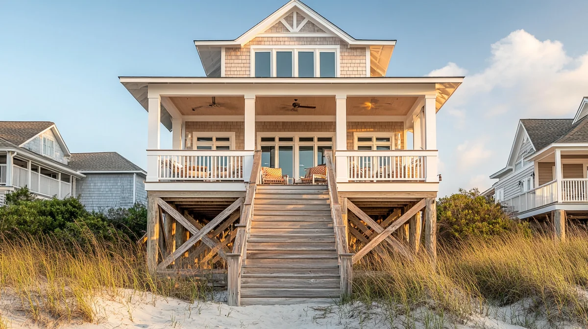

Eavesdrop on any group of friends planning a trip and you'll hear the difference between a property and a brand. One person says, "We stayed at this Airbnb outside Asheville, it was fine, I'd have to dig up the link." Another says, "We have to go back to the Bluebird house." No link required. No scrolling through nine months of booking confirmations. The name is the address, the memory, and the recommendation, all in one breath.
That's the whole game. Not a logo that wins design awards. Not a seventeen-page style guide with rules about kerning. Just a property that guests can name, describe, and hand to their friends like a gift. "The one with the green door and the record player." "The cabin with the tin lantern by the firepit." "The Bluebird house."
Most hosts never get there, and not because their properties are forgettable. The hot tub is great. The view is great. The problem is that nothing ties the experience together into something a human brain can file and retrieve. The listing has one personality, the automated messages have another, the house manual reads like it was written by a property lawyer, and the only name anywhere is a platform headline stuffed with keywords: "Cozy Modern Retreat w/ Hot Tub — Sleeps 8 — Near Downtown!"
This guide is about fixing that. What a one-property brand actually consists of, why a sign out front might be the smartest $400 you spend this year, how motels figured all of this out seventy years before Airbnb existed, and when to stop — because a single condo does not need a brand book, it needs consistency. Let's build you a name guests remember.
Step zero: the name
Everything in this article assumes your property has a name. Not a headline. A name. If yours is still called "Stunning 3BR Oasis Near Beach," stop here and go read our full guide on how to name your Airbnb property — it covers the naming frameworks, the trademark and domain checks, and the mistakes that make a name age badly. This post picks up where that one ends.
The short version, for the impatient: a good property name is two or three words, easy to say out loud, tied to something real about the place, and available as a domain and an Instagram handle. "The Bluebird" beats "Bluebird Luxury Retreat Experience." "Tin Lantern Cabin" beats "Smoky Mountain Serenity Lodge #4." Guests will shorten whatever you choose, so choose something that shortens well.
Here's why the name is step zero and not step one: every other brand decision hangs off it. The colors, the mark, the voice, the sign, the wifi card — all of it references the name. Naming a property after you've designed everything else is like naming a boat after you've painted the hull. You can do it, but you'll be repainting.
Once the name exists, something interesting happens in your own head. The property stops being "the rental" and starts being a character. You'll catch yourself making decisions the way the Bluebird would make them, choosing the mug the Bluebird would stock, writing the welcome note the Bluebird would leave. That shift — from managing an asset to running a small hospitality brand — is the real product of naming. The rest of this article is about giving that character a face and a voice.
The six-piece kit: what a one-property brand actually is
Strip away the agency mystique and a one-property brand is six decisions. Make them once, write them on a single page, and never think about them again. That's it. That single page will outperform ninety percent of your competition, because ninety percent of your competition has made zero of these decisions.
1. The name
Covered above. It goes on everything, so it comes first.
2. A simple mark or wordmark
You do not need a logo in the corporate sense. You need the name set in a distinctive way — a wordmark — and optionally one tiny symbol. A bluebird silhouette. A lantern. A wave. The test: could a guest doodle it on a napkin from memory? If your mark requires a gradient, three colors, and a tagline lockup to work, it will fail on a wifi card and it will fail carved into a wooden sign. Flat, simple, one color. Think of the classic motel signs of the 1950s: a name, a shape, maybe an arrow. Those held up at 55 miles per hour in the rain. Yours only has to hold up on a postcard.
3. Two colors
One primary, one accent. Not a palette, not a "color system." Two. Pull them from the property itself — the front door, the tile, the landscape out the window — so the brand feels discovered rather than imposed. A cabin in the pines might run forest green and warm cream. A Palm Springs bungalow might run terracotta and dusty pink. Write down the actual hex codes, because "sort of a sage green" will drift into four different greens across your listing graphics, your sign, and your welcome book within a year.
4. One typeface
One. A workhorse that has a bold weight and reads cleanly at small sizes. Use it on the website, the house manual, the wifi card, the postcards. The moment you're choosing between fonts per project, you've created a job for yourself that pays nothing.
5. A photo style
Not a photographer — a style. A repeatable set of choices about light, angle, and mood that makes any photo of your property recognizably yours. More on this below, because it's the piece hosts get wrong most often.
6. A voice
The way the property talks. Warm? Dry? A little funny? Decide once, then make the listing, the messages, and the house manual all sound like the same person. Also covered in depth below, because this is the cheapest brand asset you own and the one guests feel most.
Put all six decisions on one page — name, mark, two hex codes, typeface name, three photo-style rules, three voice rules — and save it as a PDF called "[Property] Brand Sheet." When you hire a photographer, a sign maker, or a designer later, you send that one page instead of a mood board and a prayer. Every vendor will thank you, and half will be shocked you have one.
The sign out front: your first brand artifact
If you make one physical brand object, make it the sign. Before the listing photos, before the postcards, before anything printed — a sign with the property's name on it, mounted where guests see it when they arrive.
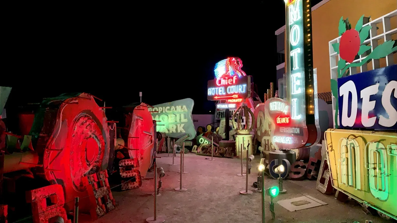
There's a long tradition behind this, and it's worth taking seriously. Mid-century American motels understood property branding decades before anyone said the words "short-term rental." A motel on Route 66 had seconds to convert a driver doing highway speed, so it put its entire brand into one artifact: a neon sign. A name, a shape, a promise — "Vacancy," "Air Cooled," "Color TV" — burning against the dusk. The Blue Swallow in Tucumcari, the Wigwam motels, the flamingo-and-starburst signs of Miami and Vegas: those signs did the work of a website, a listing, and an ad campaign at once. People photographed them then, and people pilgrimage to photograph the survivors now. Whole museums exist to preserve them. Nobody has ever built a museum for a keyword-stuffed listing headline.
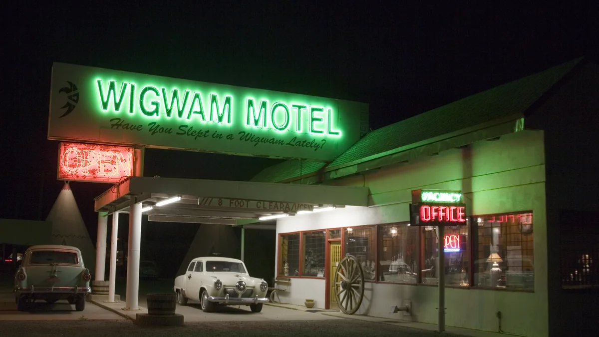
Your version doesn't need neon, though if your property and local rules can carry a small neon or faux-neon name, it will earn its cost back in guest photos alone. A carved wood sign by the driveway. A ceramic house-name plaque by the door. A hand-painted board on the gate. The medium should match the property: reclaimed barn wood for the cabin, powder-coated steel for the desert modern, glazed tile for the Spanish bungalow. Budget-wise, hosts typically land anywhere from about a hundred dollars for a quality carved plaque to the high hundreds for lit signage — check your HOA rules and local sign ordinances before you commission anything, because some jurisdictions regulate size and illumination.
Why does the sign matter so much? Three reasons. First, it converts arrival from a coordinates problem into a moment — "there it is, the Tin Lantern" beats squinting at house numbers in the dark. Second, it's the single most photographed brand asset you'll own; guests pose next to signs, and every one of those photos carries your name onto someone's feed. Third, and most subtly, it commits you. A name that exists only in a listing can be abandoned in an afternoon. A name bolted to the building is a promise, and guests can tell the difference between a property with a promise and a property with a headline.
A photo style you can repeat
Here's a test you can run tonight. Open your listing photos, your website photos, and your last nine social posts side by side. Do they look like they were taken at the same property, by the same person, on the same planet? For most hosts, the honest answer is no. The listing shots are bright and wide from a real-estate photographer, the social posts are warm phone photos, and the website has whatever was left over. Three properties, visually speaking, wearing one name.
A photo style fixes this, and it's less about gear than about rules. Write down three:
A light rule. When does your property look most like itself? The cabin might be golden hour and lamplight; the beach house might be blazing mid-morning. Pick the property's hour and shoot everything in it. A consistent time of day does more for visual cohesion than any editing preset.
An angle rule. Decide your default heights and distances. Straight-on and level, at chest height, is the most repeatable choice and flatters most interiors. Whatever you choose, the point is repetition — a grid of photos taken from consistent heights reads as intentional, while a mix of drone shots, low angles, and ceiling-tilted phone pics reads as a garage sale.
A mood rule. Lived-in or pristine? Coffee steaming on the counter and a book split open on the armrest, or every surface cleared and every pillow karate-chopped? Both work. Mixing them doesn't. The lived-in style tends to win on social and in editorial coverage because it implies a person; the pristine style tends to win in listing search results because it implies cleanliness. Many strong brands shoot pristine for the listing's first five photos and lived-in for everything else — that's a deliberate two-mode system, which is still a system.
Once the rules exist, enforcement is cheap. Your phone plus your three rules will beat a random professional shoot that ignores them, and when you do hire a photographer, the rules become the brief. This matters double on Instagram, where the grid is the brand: if you're building toward short-form video, our guide to Instagram Reels for vacation rental marketing covers how a consistent visual identity makes every clip instantly attributable to your property, even before the caption loads.
Create one "signature shot" and retake it every season: same corner, same angle, same framing. The Bluebird's porch swing in spring rain, summer light, October leaves, January snow. It becomes your brand's heartbeat — instantly recognizable, endlessly repostable, and a built-in content calendar that costs you four photos a year.
One voice, everywhere the property talks
Read your listing description, then your saved message templates, then your house manual, out loud, back to back. Most hosts discover they've hired three ghostwriters. The listing gushes ("your dream escape awaits!"), the messages are a robot ("Check-in time is 4:00 PM. The lockbox code will be provided."), and the house manual is a sheriff ("Violators of the quiet hours policy WILL forfeit their deposit").
Guests feel that whiplash even if they never name it. And the fix costs nothing, which makes voice the highest-return brand asset on this entire list. Decide who the property sounds like — one person — and rewrite everything in that voice over a single weekend.
What does deciding a voice actually look like? Three rules again, written on your brand sheet:
A warmth setting. On a scale from innkeeper-hug to concierge-cool, where does your property sit? A family lake house and a minimalist desert retreat should not sound alike. Pick the register and hold it.
A humor setting. Some properties can be funny; the wifi password card that says "the password is the year the house was built, good luck, there's a hint in the hallway" gets photographed. Some properties shouldn't be funny at all. Decide once, because humor in the welcome note followed by legal threats in the manual is the fastest way to break trust.
A few signature phrases. How does the property greet and sign off? Maybe every message ends "— The Bluebird." Maybe the manual's sections all start with "A note about..." Small verbal habits are what make a voice recognizable rather than merely pleasant.
Then do the rewrite pass. The listing gets rewritten to describe the actual experience in the actual voice. The automated messages get rewritten so the confirmation, the check-in instructions, and the checkout reminder sound like the same friendly human — you can be clear about rules without sounding like a parking citation. The house manual is the big one: it's the longest conversation your brand will ever have with a guest, and most manuals waste it. Rules can be phrased as care. "The fireplace is old and beloved — here's how to work it without smoking out the living room" enforces the exact same behavior as a warning in bold caps, and gets you a five-star review instead of a screenshot on someone's group chat.
One caution: voice is a promise, and the person answering messages has to keep it. If a co-host or answering service replies to guests, give them the three rules and the signature sign-off. A brand that's charming in print and curt at 11 p.m. when the hot tub breaker trips is worse than no brand, because now the curtness feels like a betrayal.
Small things that punch above their cost
Physical brand touches are where hosts either do nothing or do far too much. The sweet spot is a handful of small, cheap, well-made objects that guests touch, keep, or photograph. Here's the shortlist, roughly in order of return on effort:
The wifi card. Every guest looks for the wifi password within eleven minutes of arrival — this is the one brand touchpoint with a one hundred percent engagement rate, and most hosts serve it on a torn Post-it. A small framed or printed card, in your typeface and colors, with the network name and password and nothing else. Cost: nearly nothing. It will appear in guest photos forever.
Matchbook-style cards. The old hotel matchbook was a pocket-sized brand ambassador: name, mark, phone number, taken home in a million jacket pockets. The modern version is a small thick card — business-card size or the classic matchbook fold — with your mark on the front and your website and Instagram handle on the back, sitting in a dish by the door. Guests take them the way people have always taken matchbooks: as a souvenir that happens to be an ad.
Postcards guests actually mail. Print a short run of postcards featuring your signature shot, and leave them in a drawer with a pen and — this is the part everyone skips — actual postage stamps. A stamped postcard gets written at the kitchen table on the last morning and mailed from the airport. Your property's name, in a guest's handwriting, delivered into a third person's home and stuck on their fridge. There is no digital ad that does this.
A stamped welcome note. Buy a rubber stamp of your mark — custom stamps are cheap — and stamp a handwritten welcome note for each stay. The stamp is the trick: it makes a two-minute note look like an artifact instead of a chore, and it keeps the mark in front of the guest without a single piece of plastic signage inside the house.
What to skip: branded pens, branded magnets, branded water bottles, anything that smells like a conference. The test for every object is simple — would a guest keep this if it had no logo on it? A beautiful postcard passes. A promotional koozie does not. Merchandise only works after the brand does; a guest who loved the Tin Lantern might buy the Tin Lantern camp mug, but nobody wants merch from a property they can't name.
Do the math per stay, not per item. A wifi card, two matchbook cards, a stamped note, and a stamped postcard might total two or three dollars per booking — less than you're paying in credit card fees on the cleaning fee alone. One repeat booking or one direct referral per year pays for the whole program many times over. Frame it that way and the question stops being "is this worth it" and becomes "why did I wait."
The arrival moment: your brand's handshake
Every element above converges on a single sixty-second window: the arrival. A guest who's been driving for four hours pulls up, finds the sign, opens the door, and forms an impression that the next three days will only edit at the margins. This is your brand's handshake, and it deserves to be choreographed like one.
Walk the arrival as a guest, phone in pocket, bags in hand. The sequence should go something like this: the sign confirms "you're here" before the house number does. The door area is lit, swept, and unmistakably the front of a cared-for place. Inside, sightlines matter — what's the first thing visible when the door swings open? If the answer is a hallway of closed doors or a pile of cleaning supplies, rearrange until the first glance lands on the property's best beat: the view, the fireplace, the long table. The welcome note sits where the eye lands next, stamped with your mark, next to the wifi card. Lamps on, not overheads. If you're feeling ambitious, a smell: coffee beans in an open jar, cedar, citrus — scent is the most memory-adjacent sense you can brand, and the cheapest.
Notice what this isn't: a gift basket arms race. You don't need champagne and a charcuterie board. You need the first sixty seconds to feel authored — like someone imagined this exact moment and built it on purpose. The sign, the light, the note, the sightline. A guest can't necessarily articulate why the Bluebird felt different from the last three rentals before it, but their nervous system logged it at the door, and their review will say "you can tell the hosts care" — which is guest language for "the brand kept its promise."
The handshake also has a final beat most hosts forget: the goodbye. A checkout message in the house voice, thanking them by name and — gently, once — mentioning that the property's website books direct and their friends can find it by name. Arrival earns the memory; the goodbye tells them what to do with it.
How a brand compounds
Everything so far costs a weekend of decisions and a few hundred dollars of stuff. Here's why it's worth it: unlike almost everything else in hosting, a brand compounds. Cleaning is a cost every turnover. Amenities depreciate. A brand gets more valuable every stay, through four reinforcing loops.
Loop one: direct bookings. A guest can't book "that Airbnb we stayed at" directly, because they can't find it. A guest can absolutely Google "Bluebird house Asheville" — and if you've built even a simple website, they land on it and book without a platform in the middle. The name is the search query; the search query is the booking channel. Our direct booking website playbook walks through the whole machine, but understand the dependency: direct booking runs on brand. No name, no search; no search, no site traffic; no traffic, no direct revenue.
Loop two: press and features. Journalists and newsletter writers don't feature listings; they feature stories, and stories need protagonists with names. "The Tin Lantern, a restored 1940s cabin outside Asheville" is a sentence an editor can print. A platform URL is not. Every artifact in this guide — the sign, the signature shot, the voice — doubles as press material. If that channel interests you, our guide to getting press coverage for your property shows how named properties get pitched and picked up.
Loop three: repeat guests and referrals. Memory is the mechanism. Guests rebook what they can recall, and eighteen months after a trip, recall is a name and one image — the sign, the porch, the lantern. Meanwhile every matchbook card in a jacket pocket and every postcard on a fridge is a referral waiting for the phrase "you have to stay at this place." Referred guests arrive pre-sold, argue less about price, and treat the house better, because they were vouched for and they know it.
Loop four: the shareable handle. An Instagram handle that matches the property name — @thebluebirdhouse, @tinlanterncabin — turns every guest post and tag into discoverable, permanent marketing. Guests tag properties with names; nobody tags "Cozy Modern Retreat w/ Hot Tub." The handle collects social proof the way the website collects bookings, and the two feed each other.
At the top end, this compounding is the entire business model — the world's best villa brands run on name recognition and direct relationships, and the mechanics scale down surprisingly well; we broke down how in our piece on building a luxury villa direct booking brand. But the loops work at every price point. The compounding doesn't care whether the nightly rate is $180 or $1,800. It only cares that the property has a name and keeps its promise.
When not to over-brand
Now the cold shower, because this article has probably made a few of you open a tab to trademark a name and commission a brand book. Put the tab down for a second.
One condo does not need a style guide. It needs consistency. The failure mode on the other side of "no brand" is the host who spends three months and three thousand dollars on brand strategy decks, a logo suite with seven lockups, branded robes, and a custom scent program — for a two-bedroom unit that books forty nights a year. That's not branding; that's cosplay, and it delays the only things that move revenue: great photos, sharp pricing, fast replies, and a spotless house.
Here's the honest hierarchy. If the fundamentals aren't strong — cleanliness, accuracy, response time, sleep quality — branding is paint on a cracked wall, and no wordmark rescues a lumpy mattress. If you have one property, the six-piece kit and a handful of physical touches are the ceiling of what's useful; the brand sheet is one page because one page is all a single property can spend. The heavier machinery — proper identity systems, brand guidelines, art direction, merchandise — earns its keep when there's more surface to cover: multiple properties under one flag, a direct booking site competing for search terms, a social channel you post to weekly, press outreach in motion.
A quick self-test: if a brand decision doesn't change something a guest will see, touch, or read in the next ninety days, it's premature. Two colors you actually use beat a palette you don't. A voice you actually write in beats a messaging framework in a drawer. Consistency, repeated until it's boring to you and unmistakable to guests — that's the whole assignment at the one-property stage. The moment you catch yourself designing letterhead for a cabin, go clean the grout instead.
DIY or call in help
So who does the work — you, or a professional? The answer splits cleanly along the six pieces of the kit.
Do yourself: the name (with the naming guide linked above), the two colors, the typeface, the voice rules, and the writing. Nobody can voice your property better than you, and these decisions require taste and ownership more than technique. The photo style rules are also yours to set, even if a photographer later executes them. Total cost: a weekend and whatever you spend on coffee.
Worth paying for: the wordmark and the sign. A designer will turn your one-page brand sheet into a clean wordmark and simple mark for a few hundred dollars — a bounded, well-briefed project precisely because you made the six decisions first. Vague briefs are why design projects sprawl; "here's my brand sheet, I need a one-color wordmark that works carved in wood and printed on a postcard" is a brief a good freelancer can nail in a week. Then take the files to a local sign maker. This is one of the few remaining trades where local craft genuinely beats the internet: a sign maker who works in your region's weather and materials will build something that lasts decades, and there's a quiet rightness to a hospitality brand's first artifact being made by hand, by a neighbor. Hanging the sign is a milestone — treat it like one, and take the photo.
Situational: photography. If your three photo rules plus a recent phone produce photos you're proud of, ride that for a year. Hire a professional when you're launching the direct booking website or when your listing photos are the visibly weakest in your comp set — and when you do, hand over the brand sheet and the photo rules so you're buying execution of your style, not a stranger's.
Skip entirely at this stage: brand strategy retainers, agency discovery phases, and anything with "workshop" in the invoice. Those tools exist for businesses with many stakeholders who disagree about what the brand is. You are one person with one property. You do not need a facilitator to align with yourself.
How one cabin became three: the Tin Lantern
Let me tell you about Corinne, a host in the mountains outside Asheville, because her trajectory is the compounding loops from earlier running in the wild.
Corinne started with one cabin — a tight, dark, 1940s two-bedroom her grandfather built, listed for two years as "Rustic Mountain Cabin — Hot Tub — 20 Min to Downtown AVL." Decent occupancy, forgettable reviews, zero repeat guests. The property's one genuinely distinctive feature was an old tin lantern that hung by the firepit, which guests mentioned in reviews more often than the hot tub. She did what most hosts never do: she listened to what guests already remembered, and named the place after it.
The first year of the Tin Lantern was the six-piece kit and almost nothing else. A local blacksmith made a small iron sign with a lantern silhouette — her single biggest brand expense. Forest green and candle-glow gold, pulled from the property itself. One typeface. A photo rule: everything shot at dusk or by lamplight, because a place named for a lantern should be photographed lit. A voice: warm, plainspoken, a little dry, every message signed "— the Lantern." Wifi card, stamped welcome notes, and a drawer of dusk-shot postcards with stamps.
The loops took about a season to show up, then arrived all at once. Guests started photographing the sign and the lantern and tagging the handle, which matched the name, which matched the search. A regional travel newsletter, hunting for cabins with a story, could suddenly write a sentence about her — named cabin, named history, named blacksmith — and did. The feature spiked direct traffic to the simple website she'd built, where the booking calendar was hers and the fees were nobody's. Repeat guests began booking the same week each year, by name, over email.
Here's the part that matters: when a neighboring cabin came up for sale, Corinne wasn't buying a property, she was expanding a brand — and the bank, the guests, and the press all treated it that way. The second cabin launched as part of the Tin Lantern with the same sign maker, the same dusk photos, the same voice, and inherited the first cabin's reputation on day one instead of starting from zero reviews. The third followed. Today the flagship cabin carries a waitlist for peak fall weeks — guests email asking to be told when dates open, which is a sentence that has never once been typed about a "Rustic Mountain Cabin — Hot Tub."
Nothing in that story required luck, capital, or genius. It required a name guests were already reaching for, six decisions, a blacksmith, and a few years of refusing to be inconsistent.
Keep the promise small
Branding a vacation rental sounds like a marketing project, but it's really a memory project. You're deciding what a guest's brain keeps: a name instead of a link, a sign instead of a house number, one voice instead of three, a lantern instead of a listing. Six decisions on one page, a sign out front, and the discipline to repeat yourself until the repetition becomes recognition.
Start with the name, add the kit, hang the sign, and let the loops run. And if you'd rather have a partner on the wordmark, the sign files, or the whole identity, Cavmir's branding service does exactly this work for vacation rental owners — one page at a time, no workshops.
Photography via Wikimedia Commons, resized and cropped: hero, Neon Museum path by APK (CC BY-SA 4.0); inline, Businessman working and writing notes in office (Unsplash), CC0.


.jpg)