
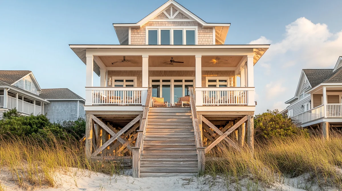

Amara has a modern A-frame in Blue Ridge, Georgia — black cladding, a wall of glass facing the trees, a hot tub on the lower deck. Her Instagram is genuinely good, and it works: her site was getting around 1,900 visitors a month, which is more than most single-property sites ever see.
Direct bookings in that same period: two. Both from people who already knew her and had emailed to ask.
This is a different problem from being invisible, and it's the more frustrating one, because the hard part looks solved. Traffic is the expensive thing to earn and she'd earned it. What she had was a leak somewhere between arriving and booking, and 1,900 people a month were falling through it.
So we did what you do: we watched. I sat with the recordings and the analytics, and then I did the thing owners find hardest, which is to open my own site as a stranger. Here's the diagnosis I ran, in order, and what it usually finds.
Start with the honest walk
Before any tool, do this. Open a private browser window on your phone. Pretend you saw the property in a post twenty seconds ago and you're mildly interested. Now try to book a specific week.
Count two things: how many taps it takes to find out whether your dates are available, and how many seconds pass before you know what it costs. Then note every moment you had to guess at something.
Amara's numbers: seven taps to reach anything resembling availability, and she never found a price at all — the page said "Contact us for rates." For a guest deciding between her A-frame and four other Blue Ridge cabins that all show a nightly rate and a calendar, that's not a small friction. That's a disqualification.
Most conversion problems are visible in that ninety-second walk. The rest of this article is what to do about what you find.
Leak one: there's no obvious next step
The most common and the easiest to fix. Property sites are frequently built as brochures — beautiful, informative, and quietly unclear about what the visitor is supposed to do.
Every page needs one obvious primary action, visible without scrolling, on a phone. Not three competing buttons. Not a "Learn More" that leads to another page that also says "Learn More." One button, saying what happens when you press it, in a color that stands out from everything around it.
The two failure patterns I see constantly: the booking button lives only in the header menu behind a hamburger icon, so on mobile it's invisible until you go looking. Or the page ends with contact details and no call to action at all, on the theory that an interested guest will figure it out. Some will. Most were only mildly interested, which is the normal state of a visitor, and mild interest does not survive ambiguity.
Leak two: you're hiding availability and price
This is Amara's leak and it's worth more than any other single fix.
"Contact us for rates" comes from a reasonable instinct — you want to talk to the guest, or your pricing varies by season, or you don't want competitors seeing your numbers. All understandable. All beaten by the reality that your guest has just come from Airbnb, where every property shows a price and a calendar, and where the entire experience trained them to expect it.
Making someone send an email to learn a price does two things. It filters out everyone who isn't yet committed enough to write a message, which is most of your traffic and includes almost everyone who would have booked. And it signals, fairly or not, that the price might be negotiable or high — because businesses that hide prices are usually doing one of those.
Show the rate. Show real availability. If your pricing is seasonal, show a range and a calendar. If you have a minimum stay, say so on the page rather than after someone selects dates and gets rejected. Every question a guest has to ask a human is a place where a percentage of them leave instead.
Example from one composite property: roughly 1,900 monthly visitors producing two direct bookings, both from existing contacts. Traffic is the expensive part and it was already solved. Before buying more of it, find out what happens to the traffic you have.
Leak three: the site hasn't earned trust
Booking direct means sending money to a stranger's website instead of a platform with a refund policy and a support line. That's a real leap and your site has to be worth it. Guests are running a quiet risk assessment the entire time, and most property sites fail it in small ways.
What builds trust, roughly in order of impact: real reviews on the page, ideally with names and dates, and ideally pulled from platforms guests recognize. A clear, plainly-worded cancellation policy stated before booking rather than buried in terms. A real human presence — who you are, a photo, a sentence about why you have this place. Actual contact details including a phone number, even if you'd rather people email. A visible secure checkout. Professional photography of every space, including the ones that aren't flattering, because a gallery that skips the second bathroom reads as a gallery that's hiding the second bathroom.
And the one owners skip most: proof the property is what it says it is. Local business listings that match. A Google Business Profile with reviews. Consistency of name and address everywhere. It sounds bureaucratic. It's what a cautious guest checks.
Leak four: there's no reason to book direct
Here's the leak that costs the most and gets discussed the least.
Put yourself in the guest's position at the moment of decision. They found your site. It's nice. They can also book this exact property on Airbnb, where their payment is protected, their review history lives, they have the app, and there's a support number if the door code doesn't work. You are asking them to give all of that up. Why should they?
If your site doesn't answer that question explicitly, the honest answer is "no reason," and a meaningful share of your site's visitors will go book on the platform — which means your website is functioning as an expensive brochure that generates commission for someone else.
Good reasons, all of which you can offer: a better rate, because you're not paying platform commission and can pass some of it back. Something material the platform booking doesn't include — early check-in when available, a late checkout, the firewood, the kayaks, a bottle of something local. Direct access to the actual owner rather than a support queue. Flexibility on dates or terms that platform rules don't permit. Priority for repeat guests, which is the single highest-value promise you can make because repeat guests are your best margin.
Then say it, plainly, on the page, next to the booking button. Not on a separate page called "Book Direct." Right there at the decision. Something as simple as a short list of what booking direct gets them, with a number attached if the number is real.
Write your book-direct reason as one sentence a guest could repeat to their partner. "It's the same place, about eight percent cheaper, and we get the kayaks." If you can't write that sentence, your site doesn't have a direct-booking argument yet — and no design change will substitute for one.
Leak five: friction in the booking flow
Every step and every field costs you a percentage of the people who started. Property booking flows accumulate friction quietly.
The usual offenders: requiring account creation before booking, which is a large drop-off for a one-time transaction. Asking for information you don't need at the point of sale — full address, how they heard about you, marketing preferences. Multi-page flows where a back button loses everything. Forms that reject a phone number format without saying which format they want. A booking widget that looks and behaves nothing like the rest of the site, which reads as being handed off to a third party at the least reassuring moment. And date pickers that are genuinely hard to use on a phone, which is more common than anyone admits.
The standard to hold yourself to: from a property page to a confirmed booking should be about three steps — pick dates, enter details, pay. Anything beyond that needs to justify itself. Ask for the rest after the money is taken, when they're committed and happy to tell you.
Leak six: your traffic and your property don't match
A subtler problem, and the reason some sites with genuinely good design still don't convert.
If your traffic comes mostly from social, a lot of it is admiring rather than shopping. People love an A-frame in the trees. Loving it and planning a trip to Blue Ridge in October are different states, and social traffic skews heavily toward the first. That traffic isn't worthless, but it converts at a fraction of the rate of someone who typed "Blue Ridge cabin with hot tub" into a search box.
So before concluding your site is broken, segment. In your analytics, compare conversion rate by traffic source. If organic search converts at a reasonable rate and social converts near zero, your site is fine and your traffic mix is the story — and the answer is more search traffic rather than a redesign. That's a different project, covered in why your site doesn't show up on Google.
The other version of the mismatch: your site attracts a guest your property doesn't serve. If the photos read as a romantic couples retreat and the property sleeps ten with bunk beds, you'll get traffic that arrives, reads the details, and leaves. Not a conversion problem — a positioning one.
The diagnostic table
Run your site against this and count the failures.
| Check | Passing looks like | Common failure |
|---|---|---|
| Primary action | One obvious booking button visible without scrolling on mobile | Hidden in a hamburger menu, or absent |
| Price | A real rate or a clear range, on the page | "Contact us for rates" |
| Availability | A live calendar the guest can check themselves | An email exchange |
| Minimum stay and policies | Stated before the guest picks dates | Discovered at rejection |
| Reviews | Real reviews with names and dates, on the page | None, or unattributed quotes |
| Cancellation policy | Plain language, before booking | Buried in terms, or unstated |
| Book-direct reason | Explicit, next to the button, specific | Absent |
| Booking steps | Three: dates, details, pay | Account creation, five pages, lost state |
| Mobile flow | Completable one-handed on a phone | Never tested on a phone |
| Traffic match | Search traffic converting; social treated separately | All sources judged as one number |
Most sites I audit fail four to six of these. The good news is that price, availability, and the book-direct reason are three of the most commonly failed and three of the most impactful — and none of them are design problems. They're decisions.
Ask three people who have never seen your site to book a specific week while you watch and stay silent. Not friends in the industry — regular people. Every place they hesitate is a leak, and you will learn more in fifteen minutes than from a month of analytics. The silence is the hard part and the whole point.
The order to fix them in
Don't redesign. Fix in this sequence, because it's ordered by return per hour.
Put a real price and a live calendar on the page. Add an explicit book-direct reason next to the booking button, with a number if you have one. Get one obvious call to action visible on mobile without scrolling. Add real reviews with names and dates. State the cancellation policy in plain language before booking. Cut every step and field in the booking flow that isn't required to take the money. Then, and only then, look at design.
Those six changes are usually a day of work and they routinely outperform a full redesign, because the problem is rarely that the site looks wrong. It's that the site doesn't answer the questions a guest is asking at the moment they're asking them.
How we build for conversion at Cavmir
Conversion isn't a layer we add to a finished site, because most of it is determined by structure — where the booking lives, what's visible on a phone, whether the guest can self-serve an answer.
Our direct booking websites integrate booking with your property management system, so guests see real availability and real rates rather than an invitation to email. The booking flow is part of the site rather than an embedded widget that looks and feels like somewhere else, which removes the trust drop at the most important moment. Every page is built mobile-first, because that's where the decision usually happens. And the book-direct argument is treated as a required piece of content, not an afterthought — because a direct site without a direct-booking reason is a brochure that feeds the platforms.
Where a property needs it, that pairs with brand work — the branding service exists because trust and rate are the same conversation, and a site that reads as ordinary can't defend an extraordinary rate. If you want the wider view of direct-channel economics before you invest, the numbers are in Airbnb versus direct booking economics.
Scopes and current pricing are on the pricing page, quoted to your actual portfolio and market, with a written proposal back within 48 hours.
Common questions
What is a good conversion rate for a vacation rental website?
It varies so widely by traffic source that a single benchmark misleads more than it helps. What is far more useful is your own rate segmented by source, tracked over time. Search traffic converts at a multiple of social traffic, because the intent is different. Judge the trend and the segments, not an industry average you found in an article.
Should I show prices on my vacation rental website?
Yes. "Contact us for rates" filters out everyone not yet committed enough to write a message, which is most of your traffic and includes nearly everyone who would have booked. Your guest just came from a platform where every property shows a price and a calendar. If your pricing is seasonal, show a range and a live calendar. Every question a guest has to ask a human is a place where a percentage of them leave.
How do I convince guests to book direct instead of on Airbnb?
Give them a reason and put it next to the booking button, not on a separate page. Workable reasons: a better rate because you are not paying commission, something material the platform booking does not include, direct access to the owner rather than a support queue, flexibility platform rules do not permit, or priority for repeat guests. If you cannot state your reason in one sentence a guest could repeat to their partner, you do not have one yet.
How much cheaper should a direct booking be?
Enough that the guest can see it is worth the switch, and not so much that you have given away the entire benefit you built the channel for. Many owners land on passing back a portion of what they save on commission, and pair it with something non-monetary — the late checkout, the firewood, the kayaks. The non-monetary part is often more persuasive per dollar, because it feels like hospitality rather than a discount.
Do I need reviews on my own website?
Yes, and they are among the highest-impact trust elements you can add. Booking direct means sending money to a website instead of a platform with a refund policy, and guests run a quiet risk assessment the whole time. Real reviews with names and dates, ideally recognizable from platforms guests know, do more for that assessment than any amount of design.
Why does my social traffic not convert?
Because much of it is admiring rather than shopping. People love a striking property; loving it and planning a trip to your market this autumn are different states. Before concluding your site is broken, segment by source. If search converts reasonably and social converts near zero, your site is fine and your traffic mix is the story — and the answer is more search traffic, not a redesign.
How many steps should the booking process have?
About three: pick dates, enter details, pay. Anything beyond that needs to justify itself. Do not require account creation for a one-time transaction, do not ask for information you do not need at the point of sale, and do not lose someone's entered data when they press back. Collect the rest after the money is taken, when they are committed and happy to tell you.
The verdict
Traffic without bookings is a better problem than no traffic, because the expensive half is already done. The leak is almost always in the same handful of places: no visible price, no live availability, no explicit reason to book direct instead of on a platform, and too many steps between wanting the place and paying for it.
Do the ninety-second walk on your own phone. Count the taps to availability and the seconds to a price. Write down every moment you had to guess. That list is your fix list, in priority order, and you didn't need a tool to produce it.
Amara's A-frame shows a nightly rate and a live calendar now. Under the booking button there's one line: book direct, save the platform fee, and the kayaks are included. Her traffic didn't change at all — same Instagram, same 1,900 or so a month. The bookings did, because for the first time the site answered the question the visitors were actually asking.
If you've done the walk and want a second opinion on what you found, send us the property and the list. We'll tell you which leaks are worth fixing first and quote anything that needs building — see the service or get in touch.
Photography via Wikimedia Commons (hero, inline, in-article); licences as noted on each file page.



.jpeg)
.jpg)